When designing a game, the balance between depth and weight is a tricky one. Every system, element, or even just rule, you add to a game brings strategy, tactics, balance, but also complexity. Fun : weight ratio, which many prefer to think of as the complexity budget, is an important aspect of game design.
Here’s the thing: there’s a lifehack to this. I have a tool to share with you which can add a lot of depth for minimal complexity, in an almost “too-good-to-be-true” infomercial kind of way.
That thing is Space. More specifically, spatial relations. Our brains think spatially, and a lot of these things are so ingrained in us that it’s harder to put in words than to actually interact with.
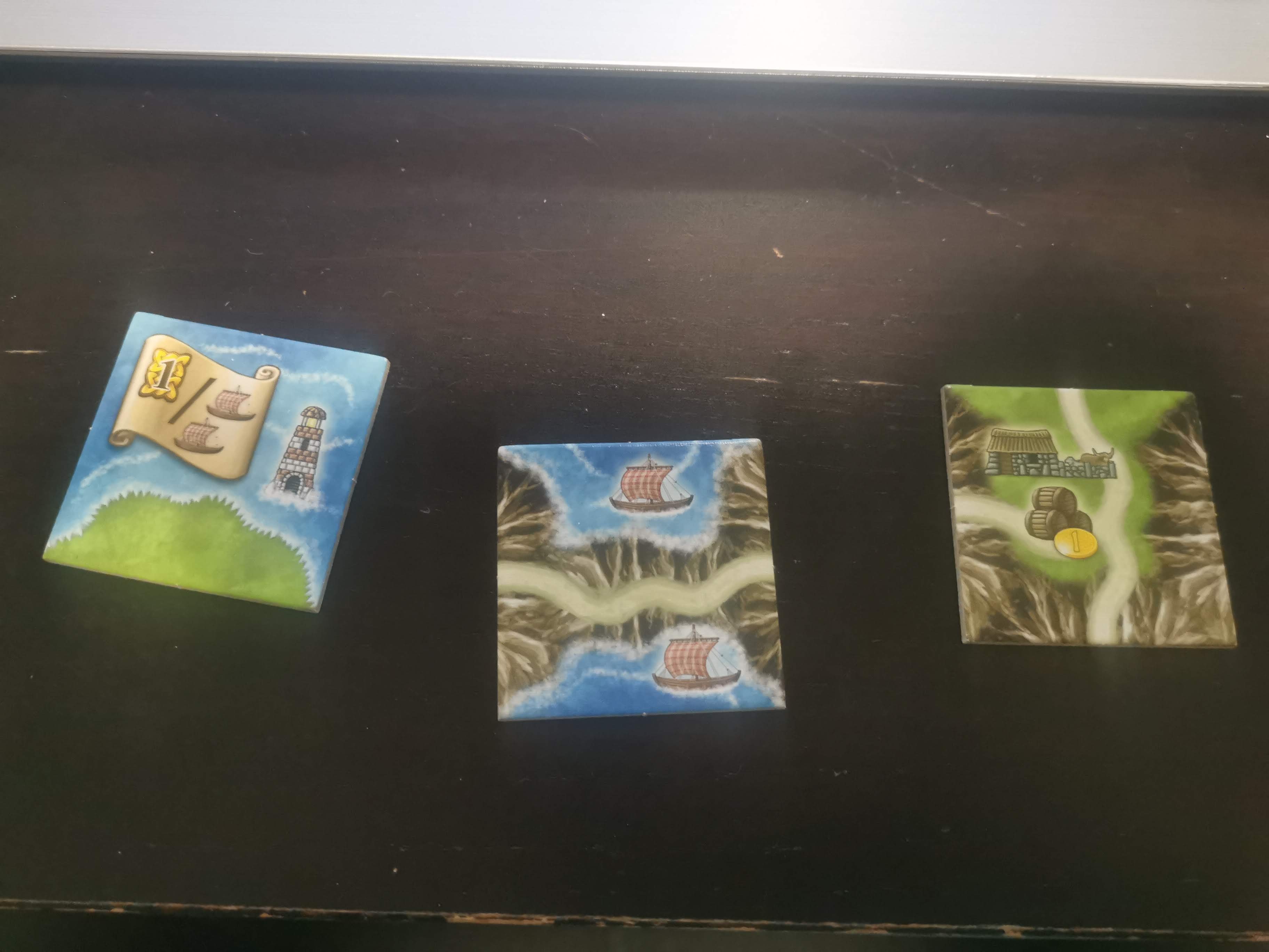
Think of the tiles in Isle of Skye: it takes a second of looking at it to parse all that it contains, not only the scrolls, buildings and barrels, but also the land types, roads, and their position on the tile. If these were cards in a tableau building game, no mechanism could make up for that depth.
Now, of course, tile laying games are built around that spatial aspect, and not every game can be about tile laying, or route building, or map skirmish. Yet, even game types which are not intrinsically spatial can be enriched, at no extra complexity, by leaning into our brains’ innate spatial understanding.
Not only good for tiles
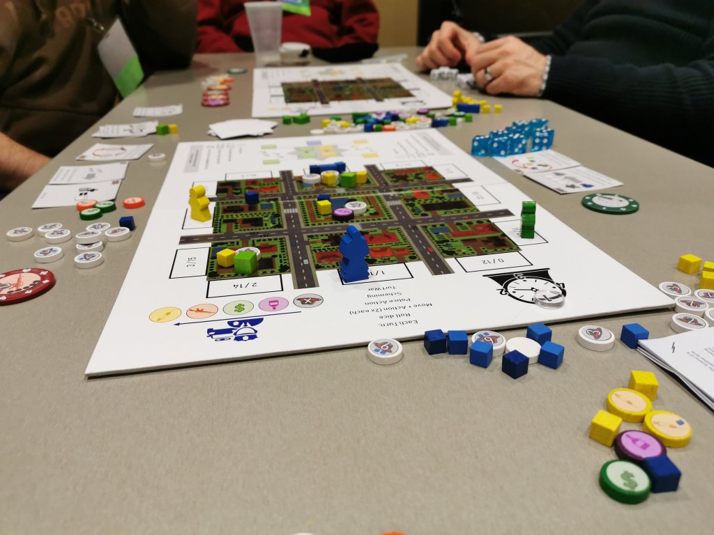
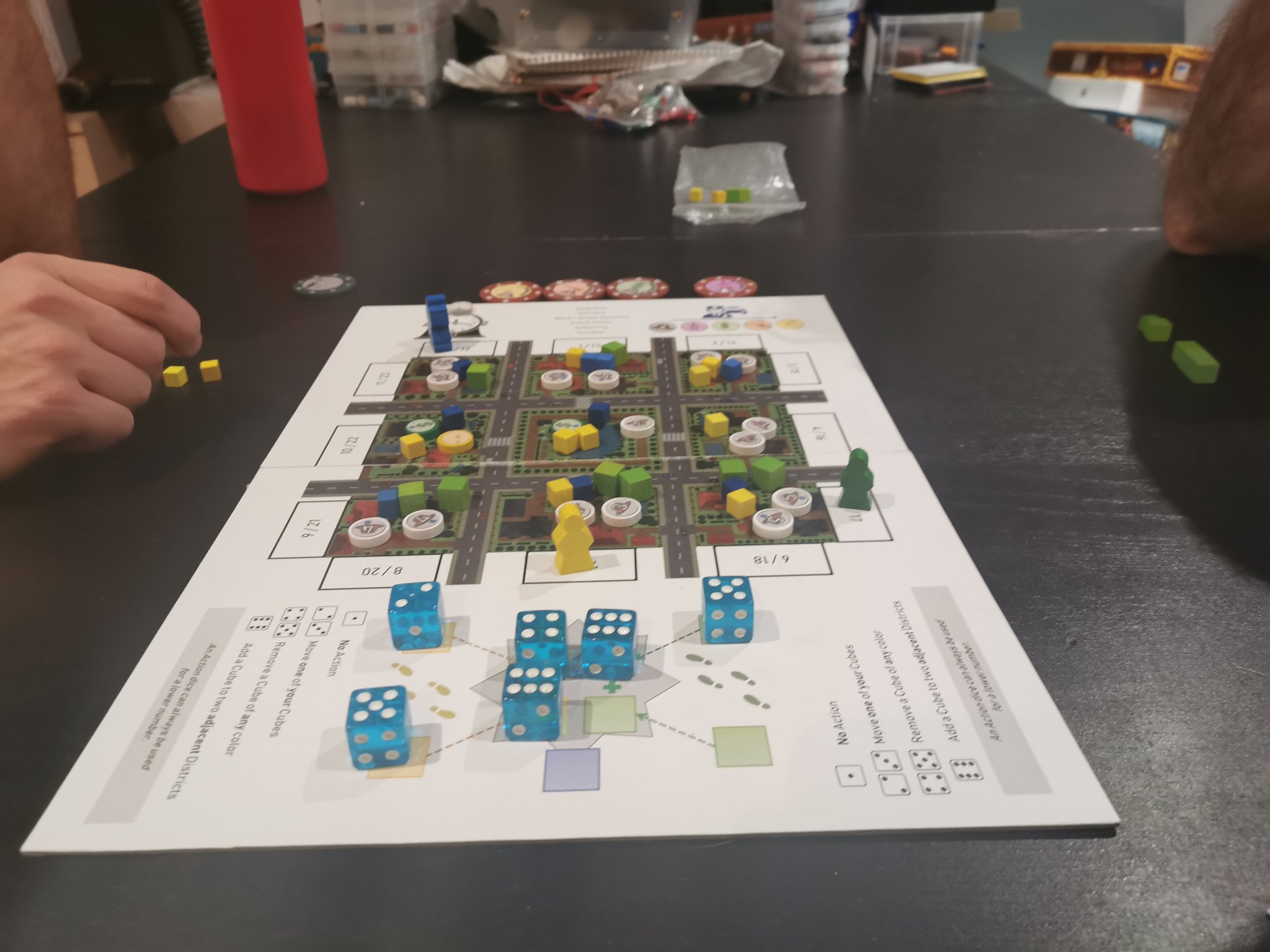
Early in With a Smile & a Gun‘s development, you would draft a die, and place influence in the district of that value: 6 districts, each associated with a number. It was easy to grasp, but a bit boring, a bit stale.
I added a lot of strategic depth to the game by making each die value affect two districts, and each district be affected by two values (using my favorite tool, the power of combinations):

By using adjacency, players grasped the relationships just as easily as they did the first version. The decision were more interesting, because of the depth this added to the game, but players didn’t have to spend more cognitive bandwidth on this system.
Version 3, the one the final game still uses, adds a lot more depth without much weight:

Now your die moves your meeple around the city, and you place cubes in the row/column in front of it. In addition to the added thematic aspect of moving your meeple, here’s all of the strategic difference this adds:
- You affect 3 districts instead of 2: the most obvious one, but a pretty big impact on depth;
- Relative numbers matter, not absolutes: going to a spot might require a 2 for me, but a 4 for you, which means I can keep you from going without having to go myself;
- Distance matters: You place 3, 2, and 1 cube, starting from your meeple, making the choices regarding the area control more granular, more dynamic;
- The possible combinations are clear: not every combination of 3 districts is possible, and that is clear to every player, even on their first game.
Not only did this system add the thematic resonance of the movement, and all of these interesting levels to the game, but by and large, players found this version simpler to grok than the first two. Of course, other effects come into play, but still: this added a LOT of depth, for virtually no complexity.
Even more intrinsic
I’ve brought this up in one of the designer diaries for the game, but it bears repeating here: there are fundamental differences between the corner districts, the side districts, and the central one, simply based on spatial aspects.
First, the 3/2/1 placement mechanism means that while a side district can receive 3, 2, or 1 cube, depending on where you’re hitting it from, corners can only get 3 or 1, and the center only gets cubes by 2s. It affects how swingy the majority for those districts are.
Second, the distance between two spots that affect a given district vary. The 4 spots to influence the central district are exactly 3 spaces apart. However, after you pass a corner, it can take a while before you get back to placing on it, especially if you need to place 3 cubes.
Now, these aren’t large differences, but they’re still there. What’s more, I didn’t even design them in: it’s just inherent to the spatial design of it. It took me a bit of time to even realize it was the case.
Remember when we were talking about depth : weight ratio? I added depth to my game without meaning to. Isn’t that some magical, snake oil kinda tool!
Other examples
Tzolk’in famously uses these large, interconnected gears to represent the passage of time. In addition to the gimmick and eye-catching aspect of the gears, this entire system would have been so much harder to represent without a spatial aspect.
:strip_icc()/pic1437866.jpg)
Pandemic is one of many examples of games which feature movement on a map, and you could say that’s an inherently spatial game and I’ve broken my own premise. However, I think it’s worth pointing out how the links between cities naturally create different experiences based on which cities are targetted at setup: 3 cubes on Santiago, with its single path out, is not the same as on Baghdad, with its 5 neighbours, or Madrid, which also has 5 neighbors, but 2 of which are of different colours. If the map didn’t include those spatial oddities, the setup variety would not be as meaningful.
:strip_icc()/pic1535381.jpg)
Battle Line (also known as Schotten Totten) is, to put it simply, a mix of War and Poker, where the two players play cards in front of a line of 9 flags, trying to make a better poker hand than their opponent. To win, you must either gain 5 of the 9 flags, or 3 adjacent ones. That extra winning condition adds a lot of tension, makes some sites more important, makes the ends of the line feel different from the middle, and all of that at no extra cognitive load.
:strip_icc()/pic1170.jpg)
Think about the design(s) you’re working on right now: is there a part of your game that you could improve (either by simplifying without making less engaging, or by enriching it at low complexity costs), simply by presenting it spatially?